
American Paintings, 1900–1945: Berlin Abstraction, 1914/1915
Publication History
Published online
Entry
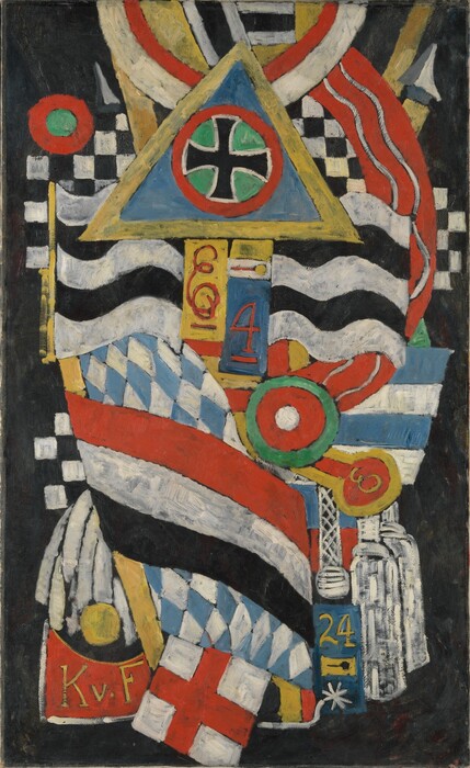
Berlin Abstraction numbers among the most innovative works in Marsden Hartley’s oeuvre, and indeed in that of any artist in the first wave of the American avant-garde. The canvas is one of a dozen deeply symbolic and personal paintings Hartley produced between November 1914 and the fall of 1915, during his second stay in Berlin. The name by which the group is best known today, the German Officer portraits, derives from the most discussed aspect of its content: the World War I soldiers to whom the paintings pay tribute, especially the artist’s cherished friend Lieutenant Karl von Freyburg. Although their primary significance is elegiac, the War Motifs, as Hartley called them, are as rich with layers of meaning as they are vibrant and complex in appearance.
Born in Lewiston, Maine, to working-class English immigrant parents, Hartley received some artistic training in Cleveland in the 1890s after his family relocated there. When he moved to New York in 1899, he studied at William Merritt Chase’s School of Art and the National Academy of Design. This restlessness was to characterize Hartley’s later life as well as his art: he traveled frequently in Europe, North America, and Mexico, painting landscapes, still lifes, and abstractions in many different styles. The location closest to his heart, however, was Berlin—he called it “without question the finest modern city in Europe.” His first two excursions there were financed by the photographer and art dealer Alfred Stieglitz, who promoted Hartley’s work in a one-man exhibition at his gallery 291 in 1909 and in a pioneering group show there the following year, Younger American Painters.
In April 1914, reunited in Berlin with Freyburg and his cousin, the sculptor Arnold Rönnebeck, both of whom he had met during his first European trip in 1912−1913, Hartley resumed his enthusiastic embrace of the “movement and energy” of the fast-growing modern metropolis—the brilliantly colored military uniforms, lively parades, and other pageantry of the imperial capital—and the city’s LGBTQ subculture, which was closely intertwined with the German military at that time. Simultaneously, his friendship with Freyburg intensified, and the two likely became lovers. In the fall of 1914, however, Hartley’s exuberance was dashed by a series of tragedies: he learned that his father had died in August, the same month as the outbreak of World War I; on October 7 Freyburg was killed in battle on the western front; and soon thereafter Rönnebeck was seriously wounded and hospitalized. These events, above all Freyburg’s death, led to Hartley’s creation of the War Motifs. After a month of intense grieving, Hartley began the series to memorialize his friend and the many other war dead and to express his abhorrence of the war in general.
As one Hartley scholar has written, despite this primary meaning, the artist’s War Motifs are multivalent and represent a major synthesis of modernism’s pictorial vocabulary. They contain heavily coded expressions of Hartley’s life in Berlin’s vibrant LGBTQ culture, the role of the German military in that culture, and an outpouring of the artist’s thoughts about war. Like the brightly colored, effusive Berlin canvases that predated Hartley’s emotional downturn, Berlin Abstraction and other War Motif paintings were strongly influenced by the modernism to which he had been exposed on his first European trip. The juxtaposition of flat, geometric, black-outlined shapes continues the artist’s espousal of synthetic cubism—he was the first American artist to fully adopt the style—which he saw when he met Pablo Picasso at Gertrude and Leo Stein’s famous salon in Paris in 1912. His loosely brushed, bright palette recalls the bold German expressionist work by Der Blaue Reiter members Wassily Kandinsky and Franz Marc, with whom he became friendly in Berlin in 1913. The two not only strongly influenced his style but also led him to embrace the spiritual aspects of art.
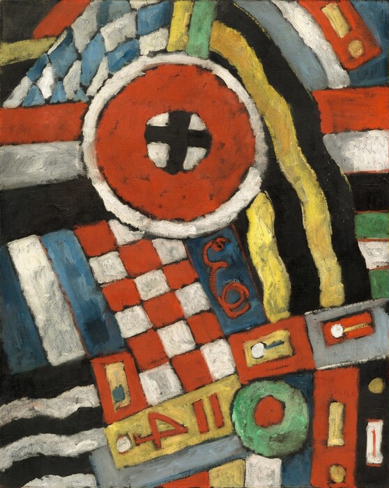
Berlin Abstraction incorporates general allusions to German military pageantry found in the other War Motif paintings: the sleeve cuffs and epaulets of uniforms; a helmet cockade denoted by two concentric circles; and the blue-and-white, diamond-patterned Bavarian flag. Other symbols refer specifically to Freyburg: the red number four signifies the Fourth Regiment of the Kaiser’s guards, in which he fought, and the red-and-white checkerboard pattern recalls his love of chess. The central black cross on a white background circumscribed by a red and a white circle is likely an abstraction of the Iron Cross medal for bravery bestowed posthumously on Freyburg. The calligraphic red letter E refers to Elisabeth, queen of Greece, the patroness of Rönnebeck’s regiment.
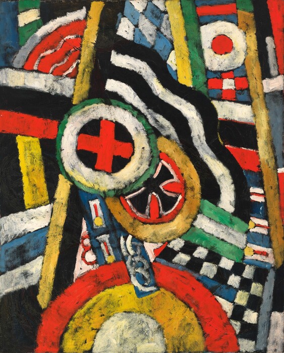
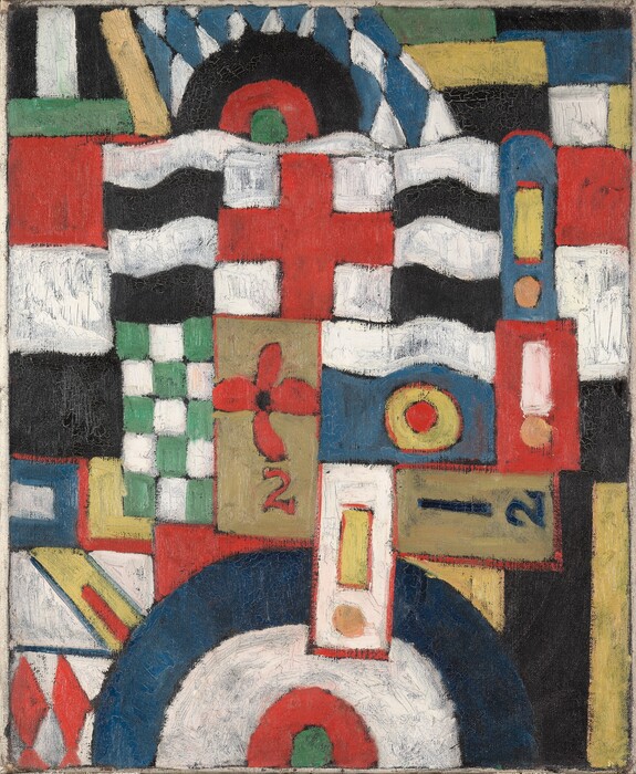
The content and style of the War Motifs evolved from symbol-laden and hieratically, even anthropomorphically, composed paintings that refer specifically to Freyburg early in the series to increasingly patterned canvases that more generally evoke the vivid designs of German military uniforms. Portrait of a German Officer , acknowledged to be the first painting in the sequence, incorporates explicit references to Freyburg—his initials (K.v.F.), his age when he died (24), and his regiment number (4)—into a composition of interlocking elements evocative of a human torso against a black background. In contrast, Berlin Abstraction is one of the three latest, most abstract paintings in the series. Along with Painting Number 5 and Military , it achieves a total absence of illusionistic space and a near erasure of recognizable subject matter, its more loosely arranged pictorial elements extending to the edge of the canvas and incorporating fewer symbols referring specifically to Freyburg.
In the spring of 1916, 40 of the Berlin paintings, including the War Motifs series, were exhibited at Stieglitz’s 291 gallery. Berlin Abstraction was likely included. Although some critics wrote favorably about the Berlin paintings’ formal qualities, others criticized them for their perceived pro-German messages. In 1916 Hartley issued a statement claiming that the group had no hidden meaning. He described their forms as “those which I have observed casually from day to day” and having “no symbolism whatsoever.” It was only after his death that the more private nature of these paintings was revealed.
Technical Summary
The painting is executed on a plain-weave, medium-weight, pre-primed canvas and is unlined. On the reverse of the fabric, “27/15370” and “2171” (crossed out) are written in black crayon, probably not by the artist. The stretcher, a replacement, is a five-member, keyable model. The priming is a thin, smooth, ivory colored layer. The opaque paint was freely applied with some brushmarking and low to medium impasto. Most of the colors were mixed with varying amounts of white paint (except for the black and possibly red). The artist apparently did not use any glazes to modify his colors. Hartley began the painting by laying in a relatively smooth layer of black paint that mostly covered the light-colored ground. The composition of red, yellow, green, white, blue, and black shapes was painted on top of the already dry black layer. Most of the paint was applied thickly, with ridges, daubs, and prominent brushstrokes, but in some passages the paint was more thinly applied and was rubbed and intentionally abraded. The black underlayer plays an important role in the design, as it remains visible through the thin paint and was left exposed around the edges of many of the brightly colored shapes. The painting is in excellent condition with only some fine cracking in the thickest white passages and a little abrasion around the edges. At an unknown time it was coated with a heavy layer of discolored varnish that was not appropriate to the painting; this varnish was removed in 2015. To preserve the subtle discrepancies in gloss that had been part of Hartley’s original execution, the painting was left unvarnished.